"Van" Background and Prop Design
- afpacsulb
- Aug 18, 2020
- 10 min read
Updated: Aug 23, 2020
Welcome to our posts all about the Backgrounds and Props done by the team for the film! Alright, so I think it's important to note something here, our Background team was the smallest of the other art teams on the project. We had relatively few members and so getting work out in time was a big challenge as there was a lot to do. However despite this, our team came together and produced some really great design work, and enough that we managed to make it through and meet our deadlines. It wasn't easy, and there was a bit of a learning curve, but I think we all grew as artists in this field. Currently speaking, this is Zack Adame, and as lead Background Artists on this project I'll take you through a tour of what our team had done!

Before we do anything though I would like to credit everyone that worked on this part of the project:
Rithyra Bin
Simon
Cole Sobol
Theresa
Kimberly Calderwood
Keely Walsh
Joseph Mendoza
Katelyn Bernardo
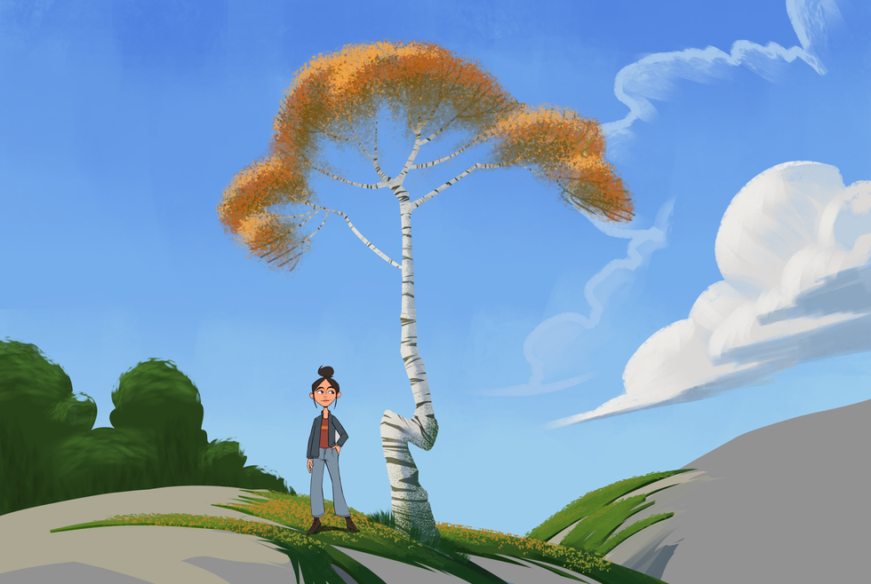
First we'll start off with the concept art. This stage is pretty much exploring the feeling of the film through concept paintings that may not resemble the final look of the film, but aims to hit some key points that would useful to us later for inspiration, maybe even lighting, or design. These early concepts were done by a few of our artists, Rithyra, Kimberly, and Nathan. They had managed to do quite a bit of these in a short amount of time which proved really useful. On the other end, the rest of the team was hard at work designing props and figuring out the look of specific subjects which we'll show next.
The first 6 are RIthyra's, the next 3 are Nathan's, and the final one is Kimberly's.


Here are the prop design explorations we did along the way. Of the things we were dealing with, it was a mixture of foliage and hard surface man made objects. Our story consists of a home, a Van interior, and the rest is wide open fields. And so an equal amount of importance had to be put into the designing of the foliage. A lot of this also came down to styling which we'll get to later. We wanted to make sure our designs were neat, fun, and simple in terms of shape and even lighting as to make the production of background paintings a less painstaking process and suit the style of the character designs which at this point were still baking.
Our artist Cole worked on foliage mostly, Rithyra did foliage and interior props, and I had done some interior and foliage design in here as well.


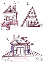
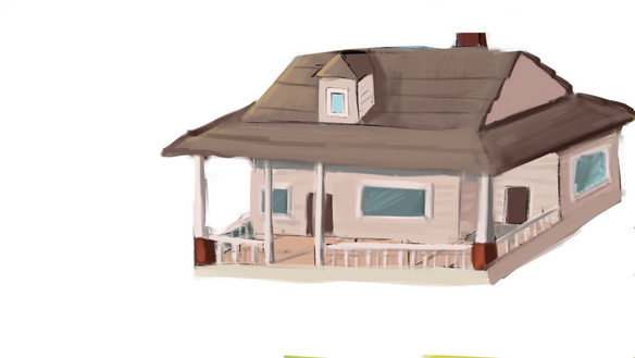
Next thing we have to show is some concepts of the house. Now the interesting thing about this design process is that we really don't see the outside except for one part. Despite this, having a general idea of the home's architecture was important for us to have in mind and so concepts did need to be made here. Our artists Kimberly, Theresa, Rithyra and Nathan all contributed to the house designs. In the end Kimberly brought our house design to a finish and we decided on a look. The hanging plants concept she explored also had the potential to become a design motif as we thought it could be interesting to use that in other spots, but that idea didn't get a chance to go too far.


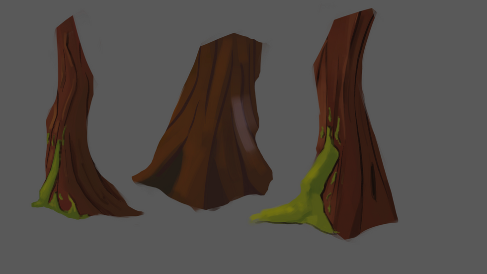
The other big responsibility we had was to narrow down a style of painting for the film. We wanted to make sure that it wasn't too realistic as this would not only clash with the characters, but also this would take way too long with the amount of backgrounds we would need (at this point we still didn't have a final number). So what makes these different from the other designs thus far is that these focus on painting and style, how to approach the problem of painting trees, simplification, and brushwork if it were to exist. Another thing we had to make sure of was that we could actually replicate what we had done multiple times. We had all sorts of levels of experience and so we didn't want to make something too difficult to pick up.
Something else we had liked was to keep a touch of texture, especially since we had simplified quite a bit. Often times you may see texture applied in intermediary areas of value or hue transition. These were done by Rithyra, Simon, Nathan, and myself. At this point maybe you can pick up everyone's stylistic tendencies. If not, there's still more to come!


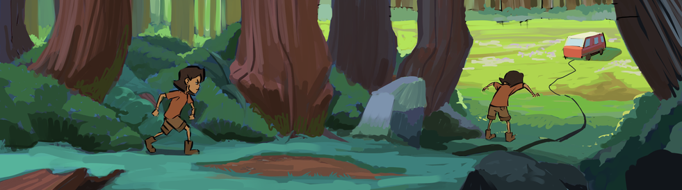
One place we would have really loved to see in a finished background was the forest. There were a lot of great ideas thrown around for how to go about this area alone. Its a shame we didn't get to that point, but the work here is a pretty good representation of our vision.
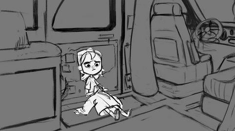
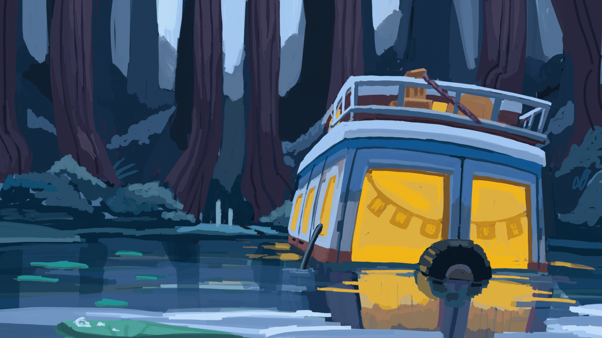
The last major thing we had to design was the Van! Very important to the story, being in the title and all. This space is the hub of our main character, and the "vehicle" (no pun intended) through which our story is centered. We have some designs here by Nathan, Rithyra, and myself, and what's interesting about this one is that since it was so important, we sent it to everyone in the club to see for critique. We would get some responses back and often times the ones we weren't so sure about were chosen! It happens and I think that in the end we did lean towards something not as stylized and more realistic in proportion. A lot of the early ideas that I had presented were a bit quirky, and we progressively narrowed them down to something more grounded which I feel was a good call on everyone's part.


Rithyra and Nathan contributed to some painted explorations of the Van as we tried to find an appealing and appropriate patterning. Eventually we still went for something simple, and the final image is the final result, and I went in for the last step which was a texturing pass. This was needed as the Van was not intended to be in pristine condition. Some surfacing helped to bring it to life, even though it's a bit tarnished from its former glory. We went with red as well since it contrasts the greenery, its not too loud, and would stand out in an open field.
These next things are technical orthos that were needed for everyone to get familiar with the space. The home interior didn't needed to be completely designed inside and out, but the Van was more important as its a very specific and confined space that we see the most often and most of. We had to make sure that it proportionally made sense in relation to other characters, and its why you had seen characters placed next to other designs previously. I had gone and done these quickly as they were needed by virtually every team for cohesion's sake.


That final image is a rough map of where our major elements are in relation to each other. Not necessarily to scale, but useful for the storyboarding team and ourselves. It's imortant to keep track things like this, big and small, because one moment you assume everyone is on the same page, but if its only in your head, you can't expect everyone to see it the same. For example I recall there being confusion about which side the door of the Van was, and you might think this isn't that big of a deal, but trust me, it was! Look at the Van Orthographic and you'll see how this can't be fixed with a simple flip, and in fact, it would mess up all of our storyboards involving it if it were drawn wrong in every one. Luckily most storyboards were drawn in the proper orientation, but it was a good catch by someone on that team and our own. So I take some responsibility for that one! A good lesson to learn, and if you can don't let it happen to you and your team will thank you!
What we have here now are some of the developing pieces of some of the actual backgrounds, and, alas, we didn't get too far past this point before we had to prematurely end production. However I did still want to share the progress. When dealing with these backgrounds, we are dealing with composition on a number of levels. One being the character, our painting's focal point (in cases where the character is on screen) is the character, and so we have to paint with that in mind. Its why you see the character placed in here as well, and we made that a standard since strange proportions were not acceptable in this stage.
So let's take you through one of the processes! I'll start with the beginning image pulled from the storyboard, and the briefing.
The first image you'll see is a screencap of a frame from one of the storyboards drawn by Sarah Henwood. We chose this one since it was an establishing shot showing most of the room which is a good place to start. Below that is a demo I had done when trying to go over the briefing for this scene for composition and visual storytelling.


The initial shot has the essentials, but wasn't quite zoomed out enough to get a feel for this space and what it means (and even in my example where i zoomed out, even this we felt was perhaps a bit too far and extreme of a lens). We wanted to try to make this even more of an establishing shot and, rather than ask the storyboarders who were already hard at work to redraw this scene zoomed out, that's where we come in. In a way, the background has the power here to make calls for the sake of composition, we can edit things in, or edit things out. The major rule though is that we don't omit essential elements. Making alterations to perspective gets tricky as well, and so we need to do or best to stick with the perspective, otherwise we can actually ruin the process for the animators. If anything, we need to accomodate them rather than the other way around. In this particular case this background actually has a prop element that is a piece of environment (the blanket) that would also be animated, so communication for this scene with them would have been important regardless.
So my advice was to zoom out, and use the elements in the scene to create a meaningful flow, and ultimately set dress the scene. In our backgrounds, we need to be sure to tell enough to the audience while not overwhelming them with information so as to not risk losing the focus. These don't stay on screen for that long, and we need to make sure that we do our job in that short amount of time.
Below you'll see a great example by one of our artists, Cole Sobol who was tasked with bringing this background to a finish. Even though Cole was fairly new to background painting, he caught on really quick to some of the principles we were trying to stress.
A lot of iterations and crit was done before reaching this point, but the final result was definitely in a direction we felt was much better. The first image is the final result, and the second was an older iteration while going through revisions and crit. As you can see the jacket was not originally positioned in a way that gave it emphasis or helped the visual flow. We decided to have it more visible and have it almost pointing toward the girl. The scene was dressed further, the orientation of objects are positioned in an attempt to give a sort of visual flow, and some lighting was explored a bit to try and bring out that extra level of focus we may end up seeing in the final result. We would have liked to spend more time on this one, it was going in a great direction but this is about where we left off.


To reiterate, the designing of a background has a lot of careful considerations, and the previous example didnt even get into lighting, color, texture, and other smaller aspects that add more layers of complexity! Though while it may sound a bit overwhelming, what makes this all manageable is that there are a series of fundamental aspects of art making that all artists use, and can fall back on. Keeping these things in kind, like perspective and composition, are the key components that we need to focus on in these, and everything else comes after.
These next things you'll see are other background sketch examples, some ideas for layout, some in the process of working on the actual layout, one is actually finished by our artist Rithyra (the kitchen) and the one I had already shown previously from Cole. One is in a gif format just to show one crit example to show the degree that we were trying to consider orientation, perspective, and lens to achieve a desired effect.


In some cases we could even use the animation frames that were being done to help us with scale.
Sometimes in this process we also try to give suggestions and critique in the most useful way we can, and sometimes that comes in the form of paintovers. These usually become more of a push and pull of advice, going back and forth, that turns into a much better result all around. Here is one example where Rithyra and I tried to find ways to improve a background he had done that was actually already working quite well. The top one was where Rithyra started and the second is where it ended in a more refined stage. and the cools of the forest worked great before we got to the Van. We made suggestions about lighting, and in my paintover I tried to see if maybe we could make the falloff of hue in the trees to go less quickly to blue and experimented with the idea of bringing more of a light into the forest at the leftmost part of the painting. The eye level was another thing we experimented with since in the storyboard our character was drawn quite high up. We had also experimented with perhaps darkening the trees to help frame things better, especially in the foreground like the rocks. We didn't want to go too dark though, and this went back and forth for a bit longer.


We also had some color keys done, looking for the appropriate mood for scenes we hadn't gotten to yet. One example is iterations for different lighting possiblities that I had done for the same background. Simon and Rithyra worked on the rain scene, looking for that melancholic and dreary mood, and Nathan had done a shot outside the house looking for a feeling of vastness.


And that's about it! There was a lot to unpack here, but I really wanted to show off, not just the work of the team, but also what the process was like and the thought processes behind the decisions we made. I hope this could be helpful to anyone who reads this; our process was not perfect, and we made some errors along the way, especially being our first time working together, but we learn from experience. Another thank you to everyone on the background team this semester, for contributing to the project, taking time out of your schedule, and thanks for bearing with all the craziness that went on during production.


Comments